What the Captcha? or why TicketMaster is lame
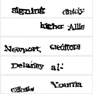
I don't know about you, but I'm really tired of trying to read those reCaptcha messages when going through TicketMaster sales screens. But hey at least they are helping a non-profit build an internet library which is great right?

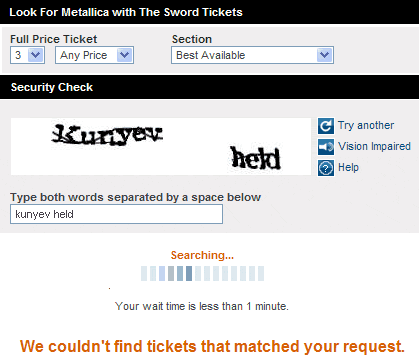
As if it is not bad enough that they have a pretty annoying and unusable multi-step, multi-page ticket sales process, recently they are starting to give out some borderline non-sense captcha validation images. How many people would just say "forget it" and leave? Well not many, since TM is an undocumented Monopoly for ticket sales in my opinion. Pretty bad user experience overall. I would love if they at least put the reCaptcha page on the same page as the ticket search form to cut down page loads. Better yet, make the whole process an ajax based system so you never have to leave the order page. It sucks to go through a blinding reCaptcha page and then get the dreaded "You're Screwed" all sold out page. Just tell me right upfront: "Hey Don't bother, no seats are available mr!" and don't waste my time. I mean I have to pay an inflated ticket price + order processing fees + convenience fees + delivery fees. Can we at least get a convenient to use website?
I went ahead and did a 2 minute reshuffling of the order form for TicketMaster and this is what I came up with. Just put all forms on one page and got rid of the clutter. Progress bar and search results would appear on the same page.

I noticed also that there are now TicketMaster hosted auctions and scalping services on site. Wonder how far they have to push the envelope before regulators are forced to step in.
Comments