One of the least used properties in CSS is the Clip property. Clip is part of the visual effects module of CSS 2.1 and its job is to place a visible window on top of an object that is being clipped. It is useful for clipping images and creating thumbnails without having to create additional files. This trick can be used to create square thumbnails, or to create other varieties of thumbnails without actually duplicating files on the server. Here is the rundown.
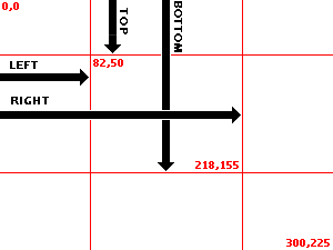
Clippings are currently only offered in the shape of a rectangle but more shapes might be supported in the future. You can create a rectangle clipping using the rect shape. Using rect requires four coordinates Top, Right, Bottom, Left (TRBL). Let’s take a closer look at how clip calculates the clipping region since it tends to cause some confusion. Keep in mind that the bottom starts from the top, and the right starts from the left.
Let’s see an example next.
Example
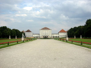
Here is a sample image we want to clip:
The CSS and HTML look like this:
.clipwrapper {
  position: relative;
  height: 225px;
}
.clip {
  position: absolute;
  clip: rect(50px 218px 155px 82px);
}
<div class="clipwrapper">
  <div class="clip">
    <img src="castle.jpg" />
  </div>
</div>
NOTE: The W3C recommendation suggests using commas between the coordinates, however this is broken in Internet Explorer. Strangely using the commas in IE does not work when in standards-compliant mode, but it does work when in quirks mode. To alleviate this issue I am not using commas which seems to work in all browsers including FireFox.
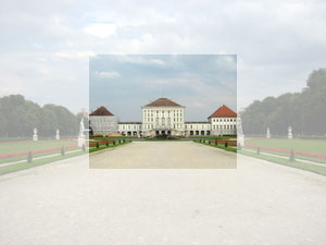
and the result looks like this:
Our class (.clip) sets the clipping region using the TRBL rotation syntax. I’m using pixels lengths but you can also try other lengths or percentages here and they can be positive or negative. You can also use auto, which would skip clipping that specific edge. You can also try nested clips. The other important thing to note is that the clipping class position must be set to absolute for the clip property to work. Here, I have used a relatively positioned wrapper div to keep our image where we want. Also specifying the height of the container div keeps the next line from overlapping with the clipped areas.
Removing the clipped areas
Keep in mind that the size of the clipped image doesn not change, but you may want to get rid of the clipped off areas. This is easy to do using the top and left offsets. First we have to set the width and height of the container div to the size of the clipped image. Now we just add negative offsets to the top and left of the clipped div to match the top and left settings in the clipping class. So now our new classes are like this:
.clipout {
  position: relative;
  width: 136px;
  height: 105px;
}
.clipin {
  position: absolute;
  clip: rect(50px 218px 155px 82px);
  top: -50px;
  left: -82px;
}
and the result look like this:
Add Some Drop Shadow
Finally to add some drop shadow to the clipped thumbnail I am using three wrapper divs with negative offsets of slightly varying background colors to create a shade effect. So our final HTML and CSS look like this:
<div class="shade1">
  <div class="shade2">
    <div class="shade3">
      <div class="clipout">
        <div class="clipin">
          <img src="castle.jpg" />
        </div>
      </div>
    </div>
  </div>
</div>
.clipout {
  position: relative;
  width: 136px;
  height: 105px;
  top: -1px;
  left: -1px;
}
.clipin {
  position: absolute;
  clip: rect(50px 218px 155px 82px);
  top: -50px;
  left: -82px;
}
.shade1 {
  width: 136px;
  height: 105px;
  background-color: #e8e8e8;
}
.shade2 {
  position: relative;
  width: 136px;
  height: 105px;
  background-color: #cbcbcb;
  top: -2px;
  left: -2px;
}
.shade3 {
  position: relative;
  width: 136px;
  height: 105px;
  background-color: #a0a0a0;
  top: -1px;
  left: -1px;
}
and here is the result:
Woot!
The CSS3 working draft includes a crop property which is very similar to the clip property but would also crop off the area we have removed, so that the original object is actually replaced with the cropped section. As far as I can see no browsers have implemented this property as of now.